效果图:
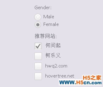
是不是比默认的好看多了,个人的审美观应该还是可以的。
当然我们可以在这里查看DEMO演示。
接下来我们一起来看看实现这款美化版Checkbox的源代码。主要思路是利用隐藏原来的checkbox和radiobox,用一个div来模拟checkbox/radiobox,并使用jQuery来完成选择切换时的动画效果。
先来看看HTML代码:
Gender:Male Female 推荐网站:何问起柯乐义hwq2.comhovertree.net
然后我们用jQuery代码来为每一个checkbox和radiobox创建一个div,这个div的classname为check-box和radio-btn。
$("input[name="radio-btn"]").wrap("<div><i></i></div>");
$("input[name="check-box"]").wrap("<div><i></i></div>");
那么我们接下来要让原来的checkbox隐藏,同时设置模拟div的样式:
.radio-btn input[type="radio"], .check-box input[type="checkbox"] {
visibility: hidden;
}
.check-box { width: 22px; height: 22px; cursor: pointer; display: inline-block; margin: 2px 7px 0 0; position: relative; overflow: hidden; box-shadow: 0 0 1px #ccc; -webkit-border-radius: 3px; -moz-border-radius: 3px; border-radius: 3px; background: rgb(255, 255, 255); background: -moz-linear-gradient(top, rgba(255, 255, 255, 1) 0%, rgba(246, 246, 246, 1) 47%, rgba(237, 237, 237, 1) 100%); background: -webkit-gradient(linear, left top, left bottom, color-stop(0%, rgba(255, 255, 255, 1)), color-stop(47%, rgba(246, 246, 246, 1)), color-stop(100%, rgba(237, 237, 237, 1))); background: -webkit-linear-gradient(top, rgba(255, 255, 255, 1) 0%, rgba(246, 246, 246, 1) 47%, rgba(237, 237, 237, 1) 100%); background: -o-linear-gradient(top, rgba(255, 255, 255, 1) 0%, rgba(246, 246, 246, 1) 47%, rgba(237, 237, 237, 1) 100%); background: -ms-linear-gradient(top, rgba(255, 255, 255, 1) 0%, rgba(246, 246, 246, 1) 47%, rgba(237, 237, 237, 1) 100%); background: linear-gradient(to bottom, rgba(255, 255, 255, 1) 0%, rgba(246, 246, 246, 1) 47%, rgba(237, 237, 237, 1) 100%); filter: progid:DXImageTransform.Microsoft.gradient(startColorstr="#ffffff", endColorstr="#ededed", GradientType=0); border: 1px solid #ccc; } .check-box i { background: url("http://hovertree.com/texiao/html5/32/css/check_mark.png") no-repeat center center; position: absolute; left: 3px; bottom: -15px; width: 16px; height: 16px; opacity: .5; -webkit-transition: all 400ms ease-in-out; -moz-transition: all 400ms ease-in-out; -o-transition: all 400ms ease-in-out; transition: all 400ms ease-in-out; -webkit-transform:rotateZ(-180deg); -moz-transform:rotateZ(-180deg); -o-transform:rotateZ(-180deg); transform:rotateZ(-180deg); } .checkedBox { -moz-box-shadow: inset 0 0 5px 1px #ccc; -webkit-box-shadow: inset 0 0 5px 1px #ccc; box-shadow: inset 0 0 5px 1px #ccc; border-bottom-color: #fff; } .checkedBox i { bottom: 2px; -webkit-transform:rotateZ(0deg); -moz-transform:rotateZ(0deg); -o-transform:rotateZ(0deg); transform:rotateZ(0deg); } .radio-btn { width: 20px; height: 20px; display: inline-block; float: left; margin: 3px 7px 0 0; cursor: pointer; position: relative; -webkit-border-radius: 100%; -moz-border-radius: 100%; border-radius: 100%; border: 1px solid #ccc; box-shadow: 0 0 1px #ccc; background: rgb(255, 255, 255); background: -moz-linear-gradient(top, rgba(255, 255, 255, 1) 0%, rgba(246, 246, 246, 1) 47%, rgba(237, 237, 237, 1) 100%); background: -webkit-gradient(linear, left top, left bottom, color-stop(0%, rgba(255, 255, 255, 1)), color-stop(47%, rgba(246, 246, 246, 1)), color-stop(100%, rgba(237, 237, 237, 1))); background: -webkit-linear-gradient(top, rgba(255, 255, 255, 1) 0%, rgba(246, 246, 246, 1) 47%, rgba(237, 237, 237, 1) 100%); background: -o-linear-gradient(top, rgba(255, 255, 255, 1) 0%, rgba(246, 246, 246, 1) 47%, rgba(237, 237, 237, 1) 100%); background: -ms-linear-gradient(top, rgba(255, 255, 255, 1) 0%, rgba(246, 246, 246, 1) 47%, rgba(237, 237, 237, 1) 100%); background: linear-gradient(to bottom, rgba(255, 255, 255, 1) 0%, rgba(246, 246, 246, 1) 47%, rgba(237, 237, 237, 1) 100%); filter: progid:DXImageTransform.Microsoft.gradient(startColorstr="#ffffff", endColorstr="#ededed", GradientType=0); } .checkedRadio { -moz-box-shadow: inset 0 0 5px 1px #ccc; -webkit-box-shadow: inset 0 0 5px 1px #ccc; box-shadow: inset 0 0 5px 1px #ccc; } .radio-btn i { border: 1px solid #E1E2E4; width: 10px; height: 10px; position: absolute; left: 4px; top: 4px; -webkit-border-radius: 100%; -moz-border-radius: 100%; border-radius: 100%; } .checkedRadio i { background-color: #898A8C; }
上面这段CSS3代码就是用样式来自定义div,让div的样式和checkbox和radiobox一样。
最后我们来模拟点击选中和取消选中,这部分也是用jQuery来实现:
 相关文章
相关文章

 精彩导读
精彩导读 热门资讯
热门资讯 关注我们
关注我们
