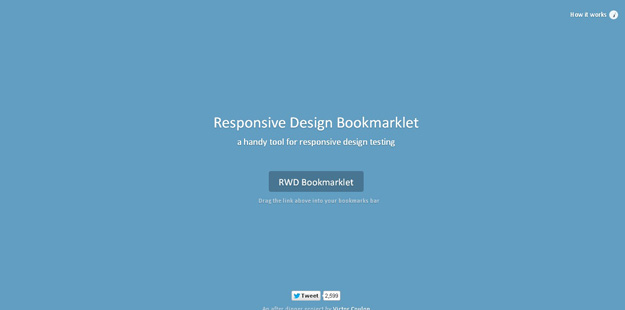
It’s a simple responsive design testing tool, you need to drag the bookmarklet above your bookmarks bar and it will be applied in your browser. You can then choose to preview the current page on screen widths the size of tablets and smartphones. 13. Adobe Edge Inspect CC
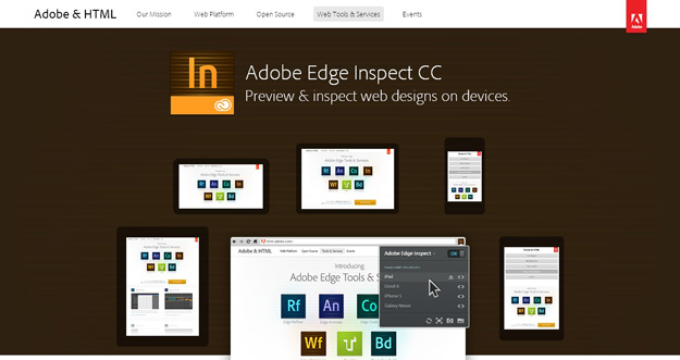
Adobe Edge lets you preview and inspect web designs on devices. 14. I am mobile
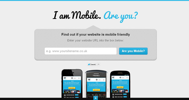
I am mobile is another good responsive design testing tool that test your web sites on various viewports and also gives you some tips to make your websites more mobile friendly. 15. Retina Images
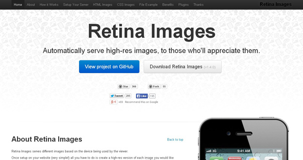
Retina Images serves different images based on the device being used by the viewer.
Once setup on your website (very simple!) all you have to do is create a high-res version of each image you would like optimized for retina screens and all the work is done for you. You don’t even need to change any img tags (providing they have a height or width).
您可能感兴趣的相关文章
本文链接:Best Responsive Web Design Testing Tools
编译来源:梦想天空 ◆ 关注前端开发技术 ◆ 分享网页设计资源
 相关文章
相关文章![[微信产品经理推荐] 有车一族福音,这个小程序能够帮到你很多忙,功能很逆天! - 腾讯攻城师lee](/images/defaultpic.gif)


 精彩导读
精彩导读 热门资讯
热门资讯 关注我们
关注我们
