前言
关于css技巧类的文章,我前面也写过很多,例如提高你css技能的css开发技巧 、css表单样式美化、css对话框的写法、css中伪元素before或after中content的特殊用法attr 等等,这些都是一些使用技巧。今天,我再列举一些平时工作中,可能遇到的题目,并写出其css解决方案。
多列等高布局实现方式何为多列等高布局?如下图这样
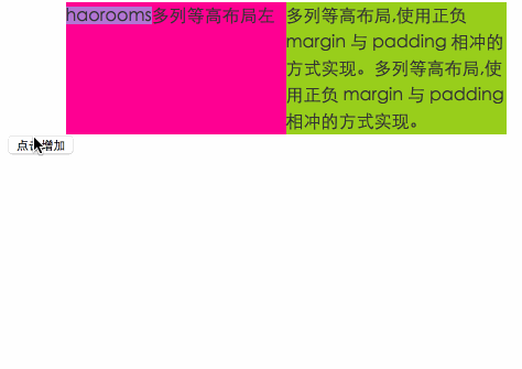
点击增加一侧文字,另一侧背景也增加。
html代码:
<div id="container"> <div class="left">haorooms多列等高布局左</div> <div class="right" id="rights">多列等高布局,使用正负 margin 与 padding 相冲的方式实现。</div> </div> 方法一: 使用正负 margin 与 padding 相冲的方式实现 #container{ width:400px; margin:0 auto; background:#eee; overflow:hidden; } .left, .right{ width:200px; float:left; font-size: 16px; line-height:24px; color:#333; padding-bottom:5000px; margin-bottom:-5000px; } .left{ background-color: deeppink; } .right{ background-color:yellowgreen; }给一个足够大的padding和负margin
二、使用 display:flex 的方式实现这个方式很简单,移动端我们经常用,container 设置为display:flex,子元素设置为flex:1就可以了。
三、display:table-cell 实现和上面方法类似,container 设置为display:table;,子元素设置为display:table-cell;就可以了。
四、 父容器设置背景色实现如下:
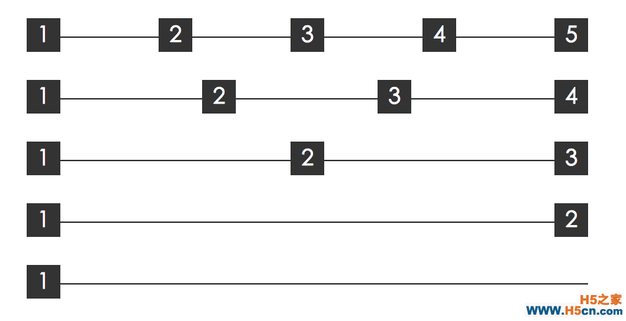
#container{ width:400px; margin:0 auto; background-color: deeppink; overflow:hidden; } .left, .right{ width:200px; float:left; font-size: 16px; line-height:24px; color:#333; } .right{ background-color:yellowgreen; } 五、父容器多重背景色--线性渐变 #container{ width:400px; margin:0 auto; background-image: linear-gradient(90deg, yellowgreen 50%, deeppink 0); overflow:hidden; } .left, .right{ width:200px; float:left; font-size: 16px; line-height:24px; color:#333; } 六、border实现 #container{ border-left:200px solid yellowgreen; background-color:deeppink; width:200px; font-size: 16px; line-height:24px; color:#333; } .left{ width:200px; margin-left:-200px; float:left; } 多列均匀布局如下图这样均匀布局
这种方法上面也讲过,实现起来比较简单,适合移动端布局。
方法二:借助伪元素及 text-align:justifyhtml代码如下:
<div class="container"> <div class="justify"> <i>1</i> <i>2</i> <i>3</i> <i>4</i> <i>5</i> </div> </div>css代码如下:
.justify{ text-align: justify; text-align-last: justify; // 新增这一行 } .justify i{ width:24px; line-height:24px; display:inline-block; text-align:center; }text-align-last兼容性不是很好,可以使用::after,
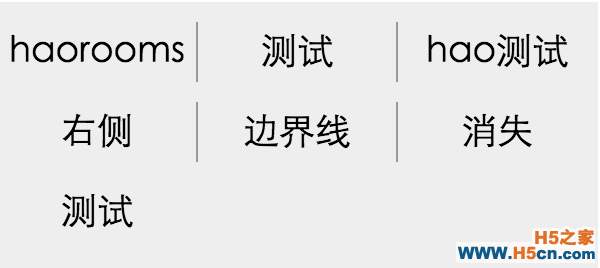
.justify{ text-align: justify; } .justify i{ width:24px; line-height:24px; display:inline-block; text-align:center; border-radius:50%; } .justify:after { content: ""; display: inline-block; position: relative; width: 100%; } 列表布局边界线问题如下图:
思路:
外层设置width,overflow设置为hidden,内层设置负边距,margin-left:-1px;就可以把左侧边距隐藏
html代码如下:
<div class="ul-container"> <ul> <li>haorooms</li> <li>测试</li> <li>hao测试</li> <li>右侧</li> <li>边界线</li> <li>消失</li> <li>测试</li> </ul> </div>css代码:
ul{ width: 300px; margin-left:-1px; } li{ float:left; width:99px; line-height:30px; text-align:center; border-left:1px solid #999; font-size:18px; margin-bottom:10px; } .ul-container{ width: 300px; margin: 50px auto; overflow:hidden; background: #eee; padding:10px 0; } 方法二 :使用伪类选择器 // 使用伪类选择器,选择第 3n 个元素去掉边框 li:nth-child(3n){ border-right:none; }
 相关文章
相关文章
 精彩导读
精彩导读 热门资讯
热门资讯 关注我们
关注我们
