在讲述之前先看一个图的基本元素:

1 线状图:
代码:(非自己创作,解析来自自带例子)
from pychart import *
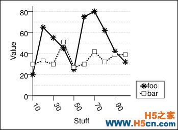
theme.get_options()data = [(10, 20, 30), (20, 65, 33),(1)
(30, 55, 30), (40, 45, 51),
(50, 25, 27), (60, 75, 30),
(70, 80, 42), (80, 62, 32),
(90, 42, 39), (100, 32, 39)]
xaxis = axis.X(format="/a-60/hL%d", tic_interval = 20, label="Stuff")(2)
yaxis = axis.Y(tic_interval = 20, label="Value")(3)
ar = area.T(x_axis=xaxis, y_axis=yaxis, y_range=(0,None))(4)
plot = line_plot.T(label="foo", data=data, ycol=1, tick_mark=tick_mark.star)(5)
plot2 = line_plot.T(label="bar", data=data, ycol=2, tick_mark=tick_mark.square)
ar.add_plot(plot, plot2)(6)
ar.draw()(7)
1 对于(1),数据的第一个列表示横坐标,后面两列表示两条线对应的纵坐标;
2 (2)和(3)表示坐标,主要用来定义坐标的式样,间隔等,分别有x,y两类,xy对应的参数基本相同。处理draw_tics_above属于X而 draw_tics_right属于Y的属性。
label表示X或者Y轴的名称,label_offset表示显示的地方,默认为x轴的下方后者Y轴的左方,居中放置;tic_interval表示坐标轴的间隔,类型为数字或者函数,如果是函数的话返回值必须是能表示坐标点如何话的list,tic_label_offset 表示坐标轴上点下的label表示的位置,默认为0,0,tic_len表示画轴上坐标的时候的长度,如果是正直,则位于坐标轴下方开始画,如果是上方,则需要用负值表示;
format表示坐标轴上数字或者标签的式样,具体的样式可以参见:
3 area表示图形的位置和大小,
常用的属性:
bg_style:背景填充的样式;#module-fill-style
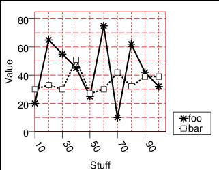
border_line_style: 图形框架线的样式#module-line-style,你可以通过修改ar = area.T(x_axis=xaxis, y_axis=yaxis, y_range=(0,None),border_line_style=line_style.red)来看到具体的效果,(效果是在图形的区域出现红色框子)
legend:就是用来表示图形每一个线用什么表示类似的标示
loc:标示图形左下角的位置
x_axis:x轴
y_axis:Y轴
y_range:Y值得范围,如果未None的话根据给出的数据自动计算,一般使用MIN/MAX来计算。如(0,None)实际表示0和Max Y的值,为80
add_plot( plot, ...):将绘图添加到区域
draw:画图
x_grid_style:背景网格线的式样,读者可以使用进行验证
ar = area.T(x_axis=xaxis, y_axis=yaxis, y_range=(0,None),border_line_style=line_style.red,x_grid_style=line_style.red_dash1,y_grid_style=line_style.red_dash2)
x_coord: Set the X coordinate system.我理解这个意思,不太知道该怎么翻译,如果有知道的可以告诉我
2 柱状图
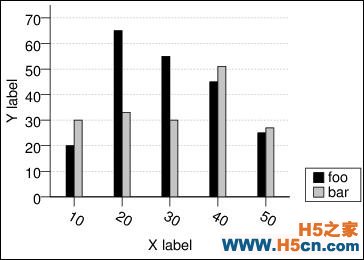
示例代码:
cluster:柱状在图中的排列位置。一般表示一个元组,第一个数表示图的相对位置,0表示最左边,第二个数表示这个位置上总共的bar的个数
bcol: 表示从base value的第一列抽取数据,基本上data,bcol,或者hcol决定bar
legend_fill_style、legend_line_style,line_style比较好理解
stack_on:值要么设置为none,要么为bar_plot,如果不为空,则一条位于另一条bar之上
3 饼状图:
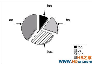
from pychart import *
import sys
data = [("foo", 10),("bar", 20), ("baz", 30), ("ao", 40)]
ar = area.T(size=(150,150), legend=legend.T(),
x_grid_style = None, y_grid_style = None)
plot = pie_plot.T(data=data, arc_offsets=[0,10,0,10],
shadow = (20, -2, fill_style.gray50),
label_offset = 25,
arrow_style = arrow.a3)
ar.add_plot(plot)
ar.draw()
 相关文章
相关文章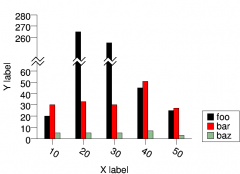


 精彩导读
精彩导读 热门资讯
热门资讯 关注我们
关注我们
